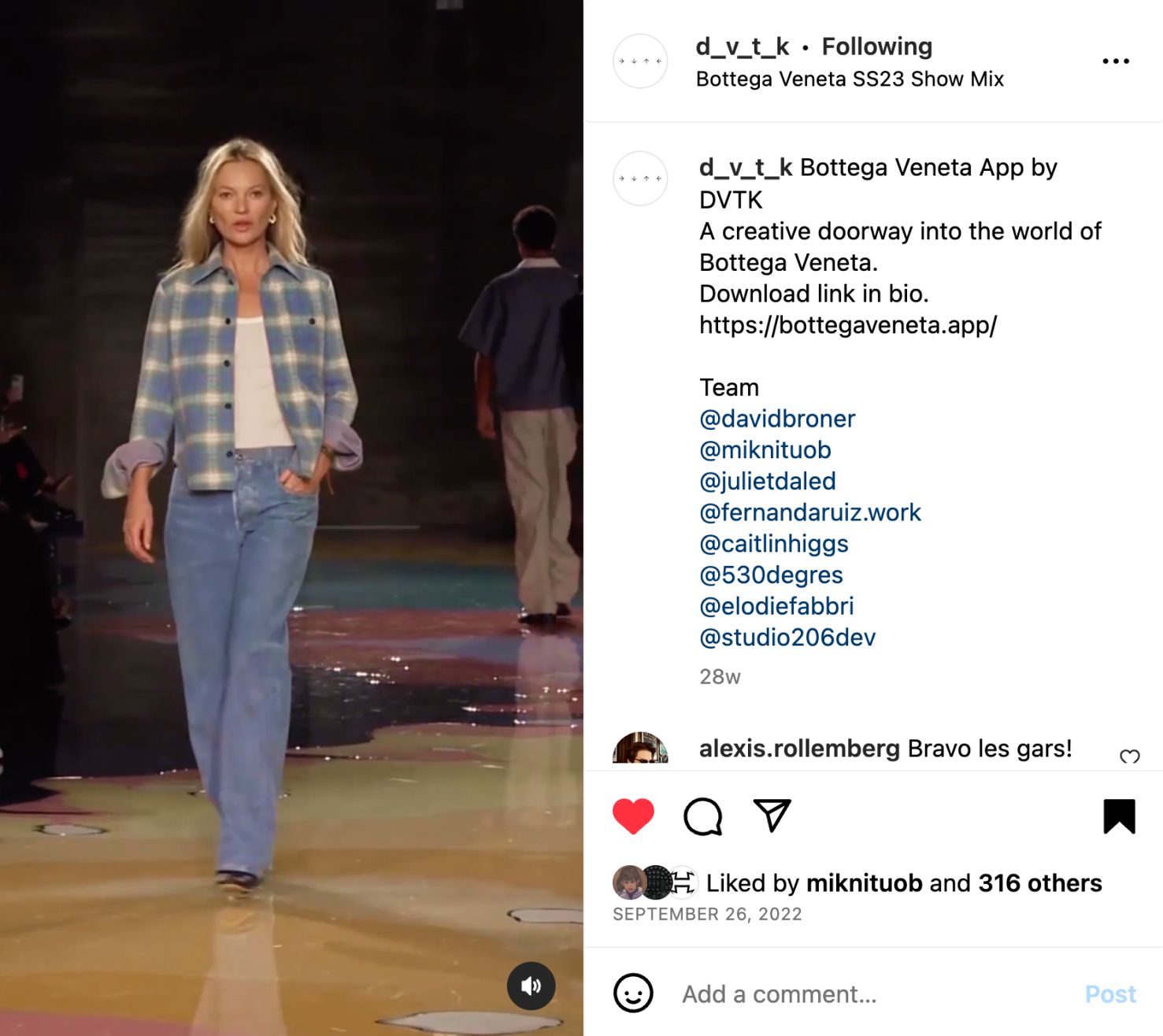
I was commissioned by DVTK to design the Bottega Veneta mobile app featuring a mysterious user interface that guides users through the Spring-Summer 23 collection.
The portal invites visitors to explore various content, from teasers and live runway videos to the look-book. My role as part of the team was to work on the UX flows, layouts, and animated prototypes. I designed a minimal user interface to place the content at the center of the user's experience. The landing page serve as an intriguing doorway, while the video player and lookbook interface were designed to be discreet and fade out when not being interacted with, allowing users to focus on the content.
Throughout this project, I collaborated closely with the DVTK team, while Studio 206 handled the development, and 530° provided the 3D.
The end result is a highly successful mobile application with an average engagement time per user of 9+ minutes.
Download the Bottega Veneta app on the App Store, or Google Store
